Logo System
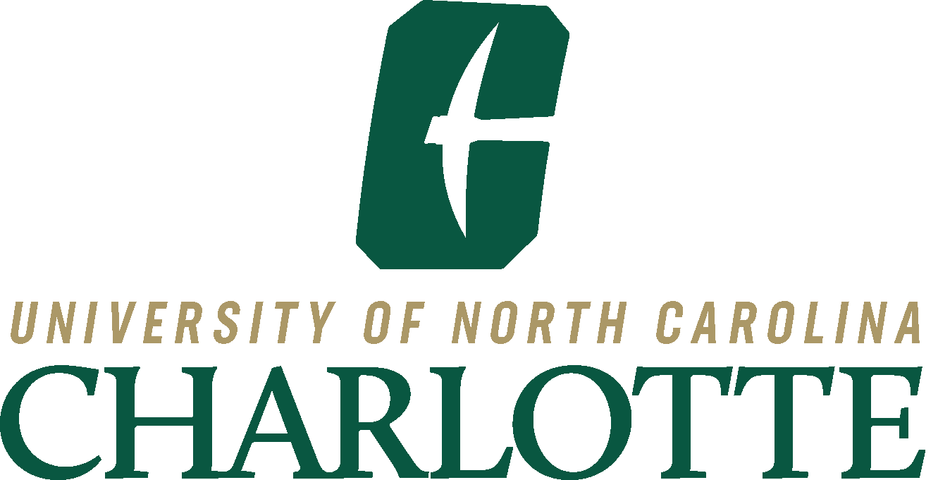
The Mark
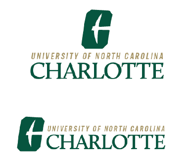
The All-in Charlotte mark combines the All-in-C logo and University text lock up. The collegiate-inspired C with the Niner’s pick has beveled corners, aggressive stance and 9° forward slant. The emphasis on Charlotte in the text lockup highlights our tie to this thriving city.
Always use the primary mark for Charlotte communications, unless sizing or printing requirements dictate otherwise.
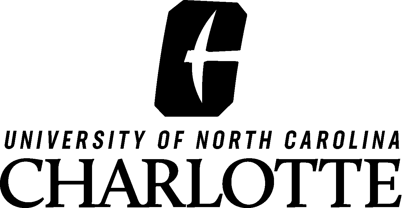
For when materials must be printed in black and white.

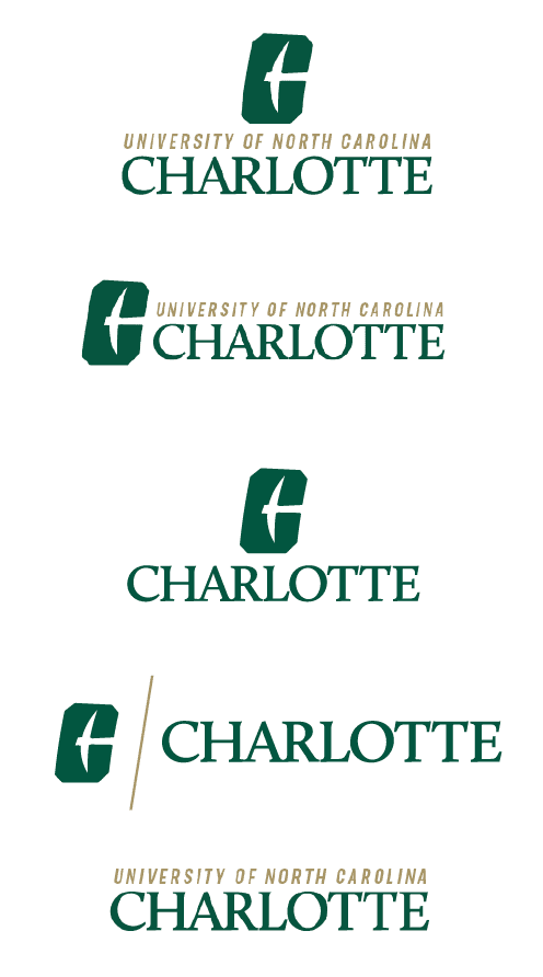
For when the stacked logo doesn’t fit properly in the space.
Two-color version
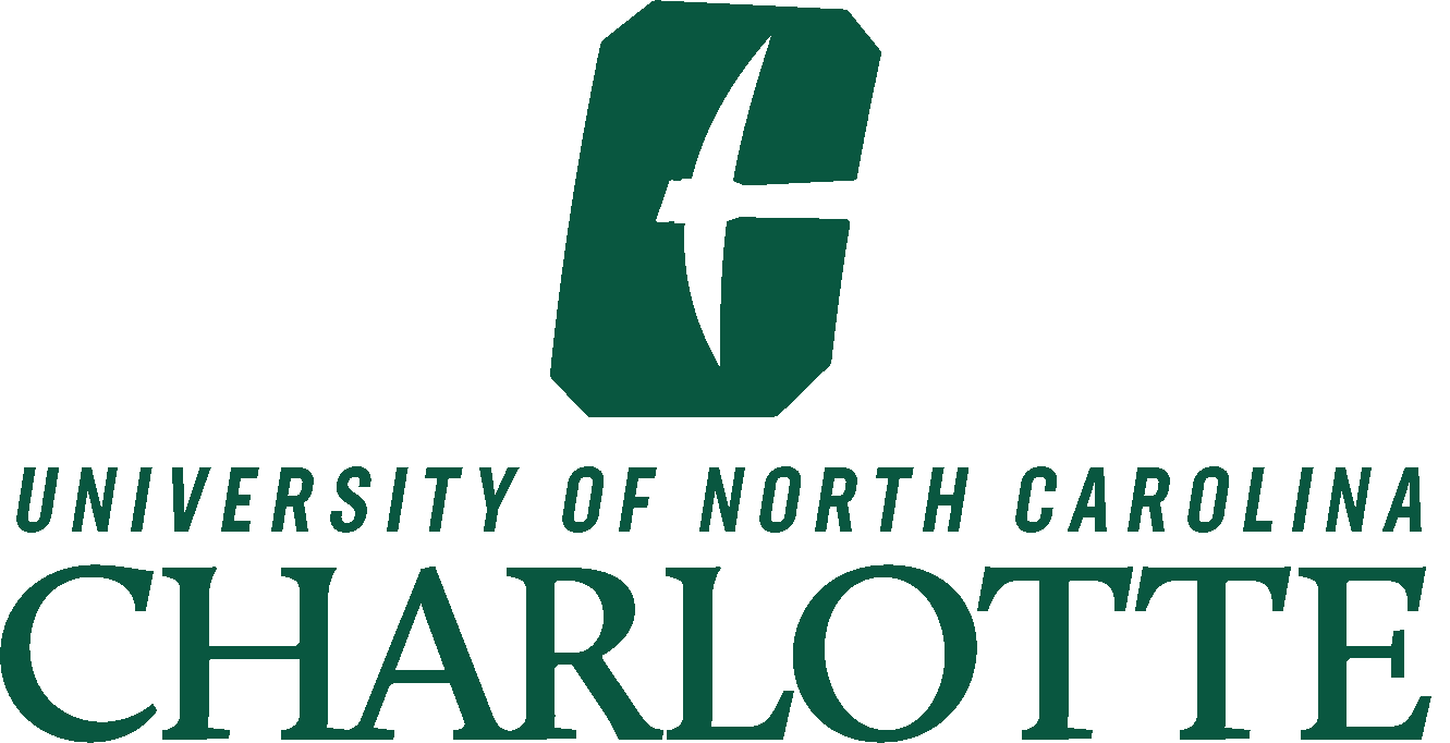
All green version
All black version
All white version
To be used on colored backgrounds when green and gold don’t show up properly, or for one color printing

In some cases, the logo can be used without the All-in C. The logotype version uses the same colors, clear space and size restrictions as the primary mark.

In some cases, the All-in C can be used without the text lockup. The All-in C uses the same colors, clear space and size restrictions as the primary mark.
Clear Space
In order to ensure readability of the primary mark, the logo should always be legible and clear from other design and type elements. Using Charlotte as a reference point (X) — please allow that same space (X) before introducing additional design elements. Note: The (X) height clear space is consistent across all logo variations including the horizontal and logo type versions. Minimum height: 1.12” Print / 80px Digital.
Improper Use
Never recreate, alter, embellish, or distort the logo in any way. Effects such as drop shadows, beveling and outer glows compromise the clean, refined look of the brand. These principles apply to any identity element within the Charlotte system: primary mark, sub-brand, typefaces and any lockup.

Doing so will throw off the balance of the logo.

Adjusting the 9° slant disconnects the logo from the brand promise.

To keep consistency, the logo should only appear in brand colors.

The All-In C icon is not to be used as letter C in order to create another word.
Quick Reference Guide
This quick reference guide is designed to help you understand the different logo options available and proper usage of each. By maintaining a cohesive, recognizable and differentiated brand identity, together we can raise the institutional profile of UNC Charlotte.
Billboards, digital displays, posters, flyers, recruitment marketing materials, ads, etc.
University Level and Admissions Marketing
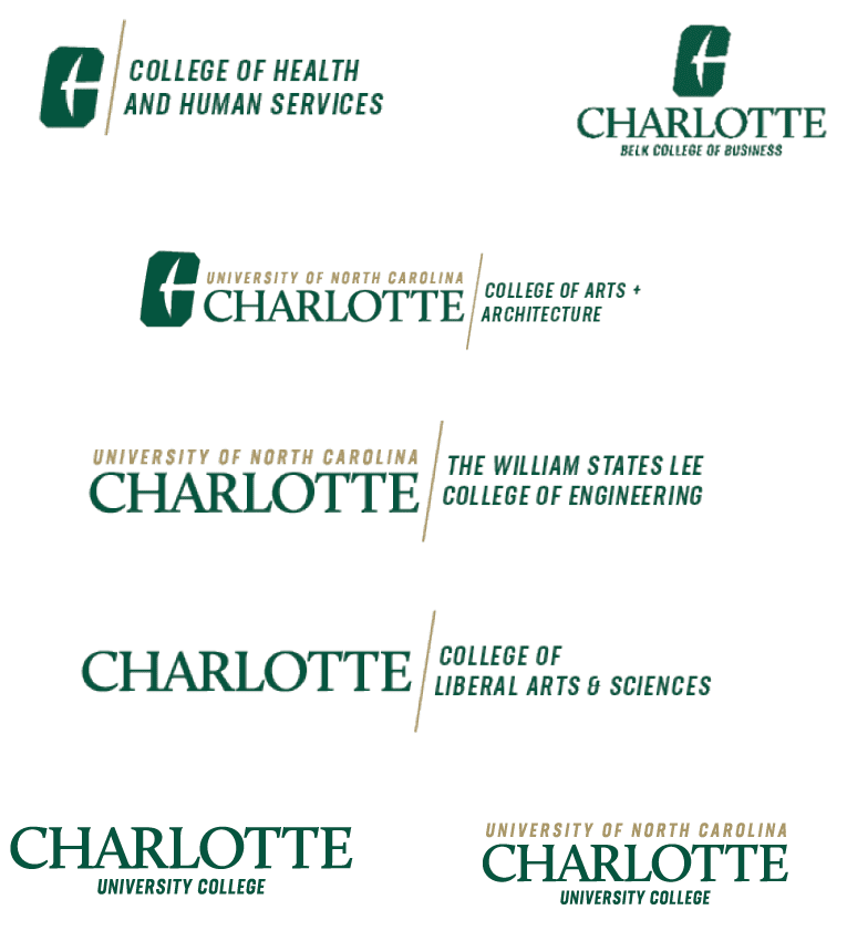
Divisions, Units, Colleges

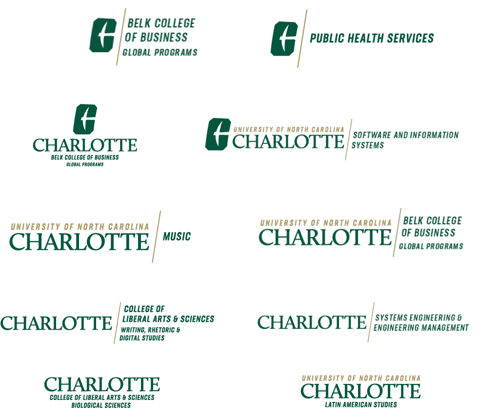
Centers, Schools, Departments, Offices and Institutes
Note: sub-brand font size increases when listed without the parent

Powerpoints, booklets, annual reports, flyers for internal/on campus use, etc.
University Level and Admissions Marketing
Divisions, Units, Colleges

Centers, Schools, Departments, Offices and Institutes
Note: sub-brand font size increases when listed without the parent

Designs may be adjusted to ensure the best result when embroidering or printing on merchandise. Work with University Communications to determine whether a heavier weight font is needed, lines should be removed, or font size should be increased. Wordmark or Charlotte spelled out should appear somewhere on the product.
University Level and Admissions Marketing
Divisions, Units, Colleges
Centers, Schools, Departments, Offices and Institutes
Note: sub-brand font size increases when listed without the parent
If a horizontal version is needed, contact University Communications.

For use in approved instances where the logo is included with a group of other logos or where there are space constraints and logos will appear very small.